Branding
🥣 Case Study: Arla Protein – Feed Your Drive
🧭 Client Brief Arla Foods tasked us with reimagining their Arla Protein line—yogurt and pudding products designed for high-performance lifestyles. The challenge: build a bilingual brand identity and packaging system that resonates across the GCC, and launch a campaign that inspires movement, ambition, and everyday strength.
🎯 Objectives
- Design a bilingual logo (Arabic & English) with strong shelf impact
- Create packaging that communicates protein content, flavor, and lifestyle appeal
- Launch a regional campaign under the theme Feed Your Drive
- Position Arla Protein as both functional and aspirational
Logo Design:
Arabic & English Harmony
We crafted a dual-language logo that balances clarity with energy:
- English: Bold, modern sans-serif with subtle motion cues
- Arabic: Custom-drawn to mirror the English form, ensuring visual unity
- Color System: Monochrome base with vibrant accents per flavo
- Lockup: Flexible for vertical and horizontal formats, optimized for packaging and digital
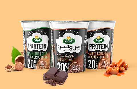
🧃 Packaging Design
Designed to stand out in retail and resonate with active consumers:
- Hero Element: Prominent protein count (20g Protein)
- Visuals: Minimal fruit illustrations with photorealistic overlays
- Finish: Matte laminate with spot UV for tactile contrast
- Language: Balanced bilingual layout (Arabic & English)
- Eco Cue: Subtle iconography for sustainable packaging
📣 Campaign: Feed Your Drive
Tagline: “Feed Your Drive”
A rallying cry for those who push boundaries—whether in the gym, at work, or in life. Channels:
- Digital: Instagram Reels, TikTok fitness influencers, YouTube pre-roll
- Retail: Branded fridge wraps, shelf talkers, and sampling stations
- Experiential: “Protein Pop-Up” tasting booths with live fitness demos
📈 Outcome
- Successfully launched the 6 products (3 Yogurt & 3 Pudding)
- Achieve 3000+ Unique reach
- We got appreciation from the client and the consumer


💼 Case Study: EIP – Electronic Investment Path
🧭 Client Brief EIP is a fintech startup offering smart investment solutions across the GCC. The company needed a strong bilingual brand identity that communicates clarity, credibility, and innovation—without relying on app design or campaign rollout. The focus was on logo creation, visual system development, and foundational brand assets.
🎯 Objectives
- Design a bilingual logo (Arabic & English) that reflects digital sophistication and trust
- Develop a cohesive visual identity for use across digital platforms, investor decks, and presentations
- Create brand guidelines for consistent usage across internal and external communications
- Position EIP as a forward-thinking, accessible investment brand in the region
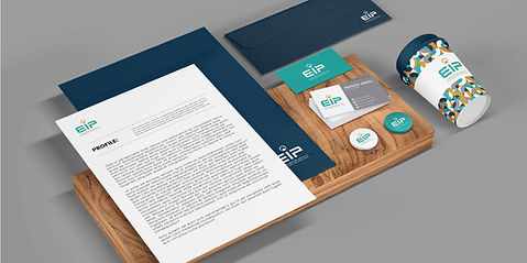
Logo Design:
Arabic & English Harmony
As lead designer, I created a bilingual logo system that anchors the brand’s identity:
- Typography: Stylized turquoise “EIP” lettering with clean, geometric forms
- Symbol: Circular orange icon resembling a road or directional arrow—symbolizing movement, clarity, and digital navigation
- Arabic Integration: “مسار الاستثمار الإلكتروني” DIN Next LT Arabic
Bold to mirror the English structure and maintain visual harmony
- English Text: “ELECTRONIC INVESTMENT PATH” in a refined Source Sans Variable Black for clarity and professionalism
- Color Palette: Turquoise for innovation, orange for energy and focus, Dark Blue for trusted investment.
- Lockup System: Designed for horizontal and stacked formats, optimized for bilingual use across print and digital
🎨 Visual Identity System
To support the logo, I developed a clean, modular brand language:
- Typography Pairing: Geometric sans-serif fonts with Arabic counterparts for balance
- Layout Principles: Grid-based compositions for investor decks, social media headers, and branded documents
- Tone of Voice: Professional, empowering, and bilingual—tailored for GCC audiences
- Usage Examples: Logo applied to pitch decks, digital headers, email signatures, and investor presentations
📈 Outcome
- Delivered a complete bilingual brand identity ready for launch
Logo adopted across investor materials, digital platforms, and internal communications
- Positioned EIP as a credible, design-forward fintech brand in the GCC market
- Received positive feedback for clarity, elegance, and regional relevance