top of page


Dano


🥛 Case Study:Dano – A Fresh Identity for Every Sip and Stage
Redesigning a Legacy Dairy Brand for MENA’s Modern Families
🧭 Client Brief
Arla Foods commissioned a full creative transformation for Dano, introducing three product lines—Dano Milk, Dano Deelac (baby milk), and Dano Steam (milk for tea)—to new audiences across the GCC, Libya, and Egypt. The challenge: unify the brand under a modern bilingual identity, redesign packaging with culturally resonant visuals, and launch a digital-first presence that builds trust and emotional connection.
🎯 Objectives
- Integrate Arabic into the existing DANO logo for regional accessibility
- Redesign packaging for three distinct product lines with tailored visuals and messaging
- Develop bilingual layouts (Arabic & English) across all brand touchpoints
- Build a responsive website and launch a campaign that connects emotionally with families
Logo Design:
As lead designer, I added the Arabic name “دانو” to the existing DANO logo, creating a bilingual lockup that feels cohesive and culturally aligned.
- Arabic Typography: Custom-set in warm yellow to complement the bold white English lettering
- Visual Balance: Designed to maintain hierarchy and legibility across formats
- Color System:
- Red background for brand heritage
- Accent tones adapted per product line (pastel for Deelac, earthy for Steam)
- Usage: Applied across packaging, digital assets, and retail displays
🎨 Packaging Design
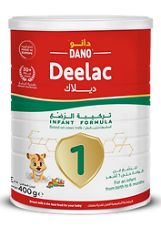
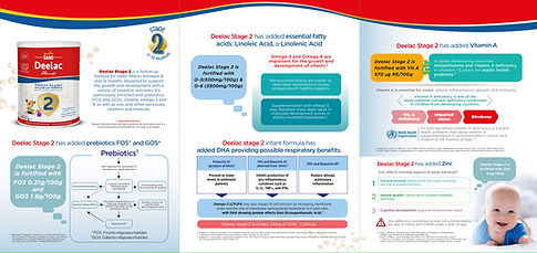
🍼 Dano Deelac – Baby Milk
- Character Design: Gentle lion mascot with soft gestures and pastel tones for all the 3 stages.
- Bilingual Layout: Clear nutritional info and preparation steps in Arabic and English
- Regional Adaptation:
- GCC: Minimalist, premium cues
- Libya & Egypt: Warmer tones and expressive visuals
- Yemen
🥛 Dano Milk – Everyday Dairy
- Design Refresh: Clean layout with splash motifs and family imagery
- Messaging: “Nutrition for Every Day” in Arabic and English
☕ Dano Steam – Milk for Tea
- Visual Motif: Smiling tea cup character with swirling steam
- Design Language: Earthy tones, elegant typography, and traditional cues
- Messaging: “Perfect for Karak, Chai, and Traditional Tea” in bilingual format
🌐 Website Design
The website unified all product lines under one digital experience:
- Homepage: Showing the most important thing in Dano (the milk comes from organic farms)
- Product Pages: Nutritional breakdowns and preparation guides
- Recipes Pages: How to use the products in your daily recipe.
- UX Tone: Warm, intuitive, and mobile-first
📣 Campaign Rollout:
“Care You Can See”
Focused on emotional trust and product clarity across MENA.
Tagline: “Care You Can See. Nutrition You Can Trust.”
Channels:
- Digital: Instagram, TikTok, YouTube
- Retail: Shelf talkers, fridge wraps, sampling kits
- Out-of-Home: Mall displays, pediatric clinics
- Influencers: Parenting and lifestyle creators across GCC, Egypt, and Libya
📈 Results
- 7M+ impressions across MENA especially in Yamen
- 40% increase in brand recall among mothers and tea consumers
- Website engagement up 3.5x with strong mobile traffic
- Positive feedback from retailers and pediatricians on bilingual clarity and emotional appeal
What i am share here it's only 10% of the work has been done.


Website Design


Designs


bottom of page